London unveils creepy-looking mascots for 2012 Olympics - Rife with Symbolism
London unveils creepy-looking mascots for 2012 Olympics
By Chris Chase | Sports.Yahoo.com
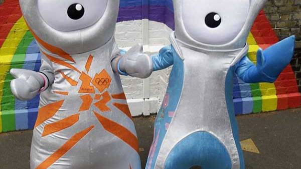
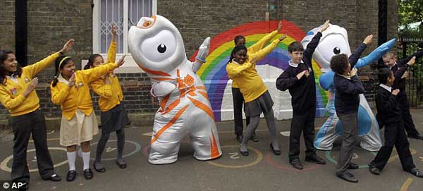
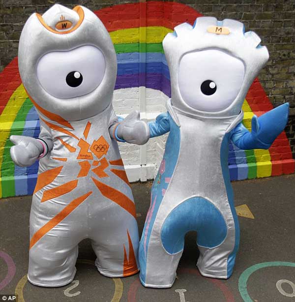
When the official logo of the 2012 London Olympics was released three years ago, the odd puzzle-piece design was the object of so much scorn that organizers were desperate to avoid similar criticism when they unveiled the mascots for the Games on Wednesday. With the introduction of Wenlock and Mandeville (above), London 2012 organizers realized their goal. The criticism of the mascots won’t be similar to the complaints about the logo. No, they’ll be much, much worse.
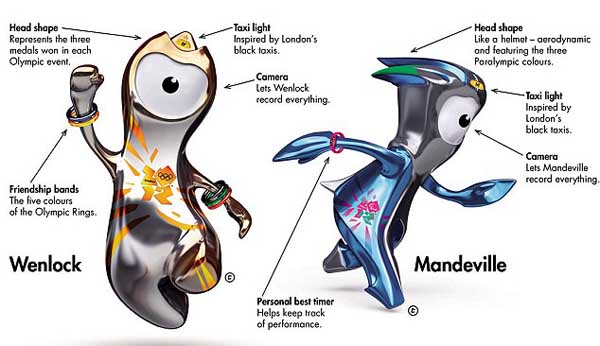
Look, I don’t know what to say. Olympic mascots have always been the object of scorn (remember Izzy?), but these two, uh, things take the absurdity to a whole new level. There’s a complicated backstory to the characters which was written by a children’s author. It explains why the mascots have one eye (it’s a camera lens to see the world) and yellow lights on tops of their heads (an homage to London taxicabs), but fails to tell the tale of why they look like early rejects from a Pixar movie. Plus, the fact that some details are explained only makes me wonder about the things that aren’t. Why does the one on the left look like it’s wearing an oven mitt? Where are their feet? What, are both those design features a metaphor for how we can’t run away from global warming?
Officials boasted that focus groups of children helped form the designs of the mascots, which makes total sense because this looks exactly like something a bunch of second-graders would create as a class project. It’s like Wenlock and Mandeville were pieced together from every child’s suggestion. "They should have one eye!" "It’d be cool if they did karate!" "Make them fly!" There was no filter. Instead of simple (like the only good Olympic mascot in history, Barcelona’s Cobi) London went for a design as complicated as can be.
The natural defense of the mascots is that they’re not designed for adults, but for the children who will convince adults to buy them a bunch of merchandise with said mascots. That’s a cop-out. Pandering to children isn’t an excuse for an uninspired design. The aforementioned Pixar caters to kids, yet its films still resonate with the older set.
Wenlock is named after Much Wenlock, a village in Shropshire which held an event in the 19th century which inspired the modern Games. Mandeville is named after the hospital at which the Paralympic Games were founded. Though both sound like Tolkein characters, the names are quite good and are the only thing that makes the mascots distinctly British.
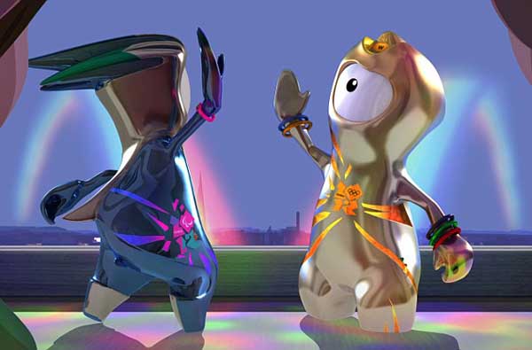
London 2012 released a video explaining the pair’s orgins as well. Somehow, it makes them look even weirder than before:
Video from: YouTube.com
On your marks for the 2012 Olympic blobs: London mascots rival that dreaded logo
By Beth Hale | DailyMail.co.uk
They only have one pair of eyes between them and look like Sonic the Hedgehog crossed with a character from the Disney film Monsters Inc.
But you had better get used to these strange blob-like creatures because Wenlock and Mandeville, as they are known, are the mascots for the 2012 Olympics and Paralympics respectively, and will be all over Britain for the next two years.
Following the ridicule over the £400,000 Olympic logo, their creators will be hoping that Wenlock and Mandeville get a more favourable reception - even though they too carry the much-mocked 2012 image.
Mayor of London Boris Johnson said they were a ’solid coalition’, adding: ’It’s hard to imagine a mascot more in tune with the times.’
However, the duo, launched with much fanfare last night on BBC1’s The One Show, require a certain amount of explanation before they begin to make any sense.
First, the names, which might ring a few geographical bells: Wenlock is named after the Shropshire town of Much Wenlock where, in the mid-19th century, the Wenlock Games became the inspiration for the modern Olympic movement.
Mandeville’s name is derived from Stoke Mandeville, in Buckinghamshire, home to Stoke Mandeville Hospital.
In the 1940s, Dr Ludwig Guttmann came to the hospital to set up a spinal unit.
Looking for ways to inspire the soldiers in his care he established the Stoke Mandeville Games, widely recognised as a forerunner to the modern Paralympics.
The characters are said to have been fashioned from the last drops of steel left over from the final support girder of the Olympic stadium in Stratford, East London.
The one-eyed figures were created by London-based creative agency Iris, whose clients include Wonderbra and Argos.
The duo have been given their own story, written by author Michael Morpurgo which has been turned into an animated film.
They also get their own website, and even individual Twitter and Facebook pages.
Organisers would not comment on the cost of creating the mascots, which they hope will generate up to £70million through merchandising.
But it is said to have been kept to just ’a few thousand pounds’ with the help of sponsors.
Stephen Bayley, founder of the Design Museum, believes his daughter summed the mascots up perfectly when she referred to them as ’rubbish earrings’.
He said: ’The logo was hideous enough but now we have these ridiculous, infantile mascots. Who is to blame for this I ask you?
’Given the economic predicament that Britain is in at the minute, what right do they have to throw their money at such hideous creatures? They are atrocious.’
London 2012 chairman Lord Coe said the mascots had been created for children and he hoped they would inspire young people to take up sport.
’By linking young people to the values of sport, Wenlock and Mandeville will help inspire kids to strive to be the best they can be,’ he said.
He said that although the designs were bold, that it was a ’tangible project’ with a back story that children would love.
’We’ve always been open about this: we wanted to do things differently in London.’
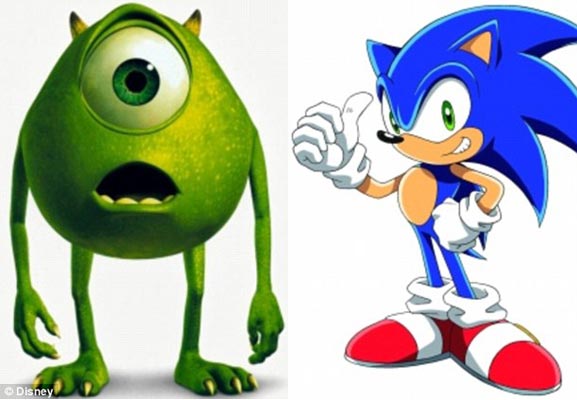
Inspiration? Mike from Monsters Inc., left, and Sonic the Hedgehog.
2012 Mascot Design Rife with Symbolic Messages
By Elizabeth Leafloor | RedIceCreations.com
Trafalgar Square erupted in cheers in 2005 as thousands gathered there to see London win the bid to host the 2012 Summer Olympic games. It was a time of excitement and hope for the future in the UK.
Fast forward two years, and in 2007 the Olympic Organizing committee released their controversial logo.
Bosses of the 2012 Olympics were plunged into a fresh row last night after spending £400,000 on a controversial new logo for the London Games.
In a move billed as the most significant event since London beat Paris in 2005 in the race to host the Games, the organising committee unveiled a striking, jagged emblem as the official symbol for the Olympics.
Aimed at the younger, "internet generation", it will will also be used as the logo for the Paralympics and will be crucial to hopes of raising private sponsorship for both events.
Based roughly on the figures 2012 and apparently inspired by graffiti artists, the image - which replaces an earlier logo devised for London’s bid to host the Games - was hailed as "dynamic" and "vibrant" by organisers.
Lord Coe, chairman of the London Games organising committee (Locog), said the new logo was "edgy" and appeared to suggest it was designed to provoke a strong reaction: "We don’t do bland - this is not a bland city. We weren’t going to come to you with a dull or dry corporate logo that would appear on a polo shirt and we’re all gardening in it a year’s time."
Tony Blair raised hopes that the symbol would leave people "inspired to make a positive change in their life" while Jacques Rogge, president of the International Olympic Committee, praised it as a "truly innovative brand" that would appeal to the young.
But the logo, which cost £400,000 and took the best part of a year to be devised by brand consultants Wolff Olins, came up against widespread disapproval yesterday, with one Jewish person even ringing the BBC to complain that it was reminiscent of the infamous Nazi SS symbol.
Design guru Stephen Bayley condemned it as "a puerile mess, an artistic flop and a commercial scandal". Source
Though petitioned to change the logo and to justify the immense cost in its creation, the Olympic committee and creator Wolff Ollins stubbornly and steadfastly refused to allow a change in the logo.
Rik Clay, Ian Crane, and other alternative researchers were quick to point out a glaring message that could be revealed if the logo was simply rearranged slightly:
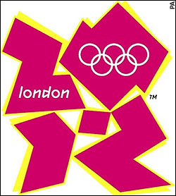
Official London 2012 Olympic Logo

The word "ZION" can be found in the image when the ’numbers’ are rearranged.
Now, in 2010, they’ve created these strange mascots, and the backlash is very similar to the displeasure of 2007.
Though strange in form, and suspect in function, it is nearly certain they will remain as the marketing choice to ’inspire kids’ (whether to participate in sports or simply spend gobs of money on expensive merchandise is still debatable).
Though the creators have a message they wish to share with us in the design of ’Wenlock’ and ’Mandeville’, there can ever be a subtext to these designs, like in the logo, and it is interesting to speculate on what they would have us think or how they would have us behave when we see these symbols.
Here’s their explanation:
But here’s another interpretation:
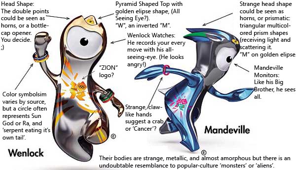
Though up to the viewer’s discretion, it becomes apparent that not all meanings will be evident to the casual observer. That is often the point of logos and mascots and symbols - the hidden meanings still penetrate the brain even if we’re not conscious of it.
Perhaps there is more to the public’s distaste of these mascots than sheer aesthetics alone.
Time will tell if the "few thousand pounds" spent on these walking symbols will pay off for their creators.
