Rio 2016 Emblem Unveiled, First 3-D Olympic Logo
Rio 2016 Emblem Unveiled, First 3-D Olympic LogoBy Kristyn Gansen | suite101.com
The Olympic logo for the Rio 2016 Olympic Games has been unveiled, giving the world a glimpse of a modern and progressive Olympic vision.
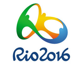 With the unveiling of the logo for the 2016 Summer Olympic Games, the Rio de Janeiro Organizing Committee has made one thing clear: the 2016 Olympic Games will be progressive, futuristic and modern.
Rio 2016 Olympic Logo: First 3-D Olympic Logo
Showcasing three human-like figures, the 2016 Rio de Janeiro logo, which was first shown to the public on the Copacabana beach on New Year’s Eve, is the first ever three dimensional Olympic logo. The logo, which features an orange, a green and a blue figure, each intertwined to create both space and vibrancy, was created to showcase and represent the culture of Rio de Janeiro and Brazil while welcoming those from other nations, backgrounds and ways of life.
“The Rio 2016 Games brand communicates passion and transformation. The passion cariocas and Brazilians, in general, have for sport and celebration. And the transformation the Games are already bringing to Rio and Brazil,” Carlos Arthur Nuzman, the President of the Rio 2016 Organizing Committee, said on the Rio 2016 website.
The symbol was chosen because it best represented four ideals, according to the site. Those ideals include contagious energy, harmonious diversity, exuberant nature and Olympic spirit — the four pillars of Rio’s Olympic Games.
Olympic Emblem: The Creation of the Rio 2016 Logo
The final design was created by Tatil, a Rio de Janeiro-based design agency, and was chosen from among 139 submissions. During the five-moth process, the Rio Organizing Committee whittled the submissions down to eight finalists, eventually choosing the Tatîl design.
The design is reflective of the Rio de Janeiro bid, culture and ideals, according to International Olympic Committee President Jacques Rogge, who was present at the unveiling ceremony in Brazil on Dec. 31, 2010.
“I would like to congratulate the Rio team for their choice of design for the Rio 2016 emblem, which I find very innovative and creative. It truly reflects Rio and Brazil’s vision for these Games, Brazilian’s passion for sport, and the coming together of different cultures around one project – the Olympic Games,” Rogge said after the unveiling, according to the Rio de Janeiro Olympic website
“Tonight, we saw Rio at its most passionate with millions of people gathered on Copacabana beach. This is a taste of the atmosphere that I’m sure athletes and spectators can expect in 2016 and a feeling that I’m sure the new symbol will help communicate far and wide. I think that all of Brazil should be proud of their new emblem and I for one look forward to seeing it become a key part of Brazil and Rio’s Olympic story.”
Olympic Logo Gives Host City an Identity
Because the logo becomes a type of face for the host city, the choosing an appropriate emblem is one of the most important and difficult tasks of the organizing committee, according to IOC Coordination Commission Chair Nawal El Moutawakel.
“The choice of an emblem for a host city is a crucial decision because it sets the tone and becomes the ‘face’ of those Games forever,” Nawal El Moutawakel said in a written statement. “I would therefore like to congratulate Rio 2016 on their selection because I believe that they have been able to perfectly capture their vision, and the emotion of Rio and Brazil, in their new logo. I have no doubt that it will become one of the world’s most recognizable brands over the coming few years and that it will help spread Rio’s message of passion and transformation across the planet.”
The 2016 Rio Summer Olympic Games will begin Aug. 5, 2016 and end Aug. 21, 2016. To see the logo, visit the official Rio 2016 website.
Article from: suite101.com
Rio 2016: Emblem Launch
Video from: YouTube.com
"Olympic organizers have said the Rio 2016 brand was created to reflect the city’s culture and represent its natural wonders and joyful residents. Organizers said the logo was based on four pillars: contagious energy, harmonious diversity, exuberant nature and Olympic spirit.
Nearly 140 agencies initially participated in the process to design the logo and only eight made it into the final phase. A multidisciplinary team of 15 national and international members of Rio 2016’s organizing committee made the final decision a few months ago, selecting a design created by the Rio agency, Tatil."
Source
The Rio 2016 Olympic logo has apparently drawn colors from their native Brazilian flag, yellow, green and blue.

The national flag of Brazil (Portuguese: Bandeira do Brasil) is a blue disc depicting a starry sky spanned by a curved band inscribed with the national motto, within a yellow rhombus, on a green field. Brazil officially adopted this design for its national flag on November 19, 1889, replacing the flag of the second Empire of Brazil.
The green field and the yellow rhombus from the previous imperial flag were preserved – the green and yellow colors representing the Braganza-Habsburg dynasty.
A blue circle with 27 white five-pointed stars replaced the arms of the Empire of Brazil. The stars’ position in the flag reflect the sky over Rio de Janeiro on November 15, 1889.
It presents the motto "Ordem e Progresso" ("Order and Progress").
Source
"The new logo was modelled as a dynamic 3D design that event organisers plan on implementing at various stages of the games. Its usages will include 3D sculptures, animations and laser light shows. The options are endless really."
Source
Rio 2016 logo designers deny plagiarism
From: zeenews.com
Sao Paulo: The designers of the logo for the 2016 Rio Olympics insist any similarity to one from a U.S. foundation is a coincidence.
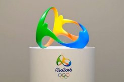 The designers defended their logo after Brazilian media noted similarities with the logo of the Telluride Foundation in Colorado.
The comparisons began shortly after the Olympic logo was unveiled before about 1 million people on New Year’s Eve at Rio’s Copacabana beach. Both logos depict figures embraced at the arms in a flowing motion.
The director of the Brazilian agency that created the logo said he had never seen the foundation’s version. Fred Gelli told the GloboEsporte.com website the agency did extensive research to guarantee the design was unique.
"For some reason, we missed that one," Gelli said.
Gelli acknowledged a "similarity" with the foundation’s logo, but said the broad concept of people embracing each other is not novel.
The Telluride Foundation says on its website that it promotes philanthropy and provides "grants and services to the community in support of arts, education, athletics and all charitable causes."
Gelli also dismissed similarities with the painting "The Dance" by Henri Matisse.
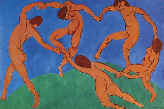
"The brand is radically different because it is tri dimensional," Gelli said.
Gelli’s Tatil agency entered the process to design the logo along with nearly 140 other competitors. A team of 15 national and international members of the organizing committee for Rio 2016 made the final decision a few months ago.
A giant TV screen set up on the sand at Copacabana beach beamed the logo to cheering spectators before a massive flag bearing the image was rolled out on top of the crowd.
Organizers say the logo is based on four concepts: contagious energy, harmonious diversity, exuberant nature and the Olympic spirit.
The Rio Olympics will be the first in South America.
Article from: zeenews.com
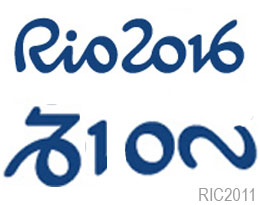
Hidden Message?
~E
